Letter Fonts - Stylish Text
- 4.2
- Rating
- 10.00M
- Installs
- Free
- Price
 Analysis by App-foxy
Letter Fonts - Stylish Text is the kind of personalization app I reach for when ordinary keyboard text feels too plain, but I do not want to redesign my entire phone. Its main idea is simple: give everyday messages, captions, profile descriptions, and social posts a more distinctive appearance through alternative letter styles. After using it, my view is that it works best as a quick creative layer rather than as a complete writing tool. It can make a short caption stand out in seconds, although it is less convincing when used for long conversations or anything that needs maximum readability.
That balance is important. The app is free to install, belongs to the personalization category, and comes from TarrySoft. It has reached over ten million installs and holds a 4.3 average from roughly ninety-five thousand ratings, so it clearly appeals to a large audience. I would recommend trying it if you regularly use Instagram, WhatsApp, or other social platforms and want more control over the visual tone of your words. I would not recommend treating every decorative style as an improvement, because some are difficult to read and can make a message look less polished instead of more original.
What using the font collection is really like
When I use a font collection like this, the useful question is not how many styles I can browse, but whether a choice stays clear once it leaves the preview. I’d treat each option as a small accent, then check the finished text in its intended setting before sharing it. That practical test makes it easier to judge which styles deserve a place in my routine and which are better left as occasional experiments.
You May Also Like

 Blood Strike: 2.5 Anniversary
Blood Strike’s Loadouts Turn Every Drop Into a Tactical Gamble
A close look at Blood Strike’s custom loadouts: how fast access to signature weapons reshapes its battle royale rhythm, rewards preparation, and narrows the gap between fights.

 Pandora - Music & Podcasts
Pandora’s Music Is Easy to Start, but Harder to Recover
Pandora’s strength is its low-effort path from a seed to a station. Its weak spot is how much confidence it asks you to place in connection, setup, and quiet recovery.

 8 Ball Pool
 Is Built on Rivalries, Rematches, and Routine
A close look at the rivalries, rematches, shared routines, and unanswered safety questions that turn a quick pool match into a persistent mobile community.

 Samsung Music
’s Quiet Strength Is Playing What You Already Own
Its reach comes less from spectacle than from dependable access to a personal library. That simplicity is both the app’s strongest retention engine and its ceiling.

 AccuWeather: Weather Radar
AccuWeather Review: A Quick, Clear Forecast for Everyday Decisions
For everyday plans, the best forecast is the one you can understand quickly. AccuWeather makes rain timing, radar, and local conditions easy to act on, with a few trade-offs.

 Hill Climb Racing
Why Hill Climb Racing Still Turns Crashes Into One More Run
A tiny car, a bumpy hill and one more upgrade: Hill Climb Racing keeps resurfacing because its simple chaos makes every near-miss feel personal.
More From Our News Desk



A fast way to change the mood of short text
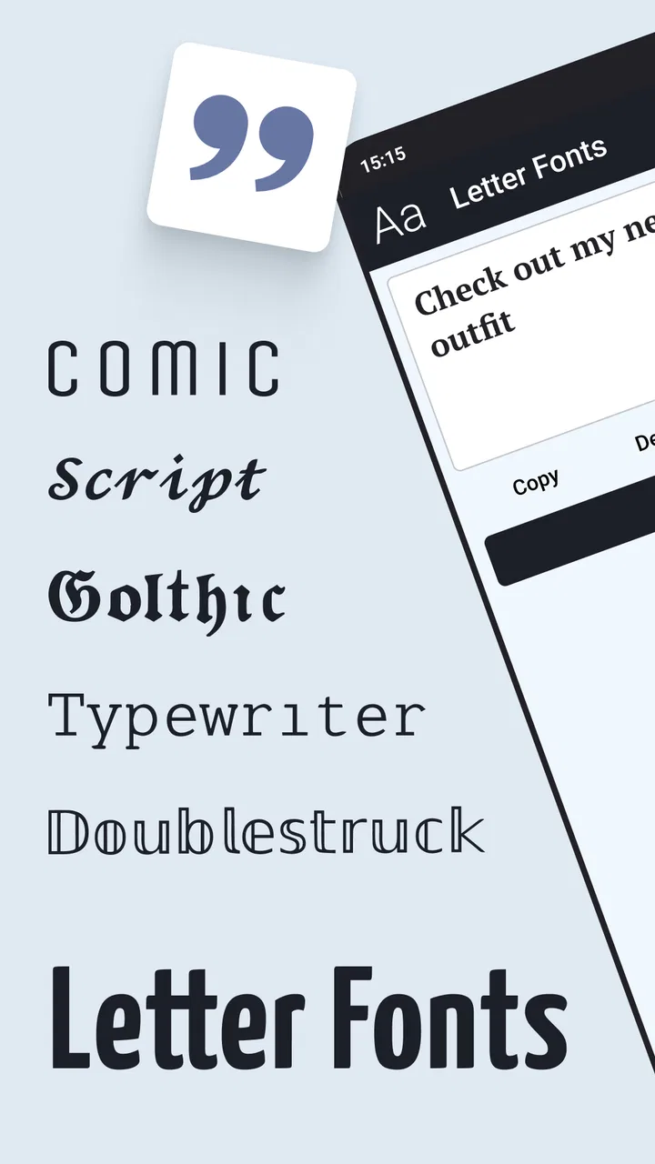
The strongest part of Letter Fonts - Stylish Text is the immediate change from standard writing to something visually different. A normal phrase can become playful, formal-looking, dramatic, soft, or attention-grabbing depending on the style I choose. That makes the app useful for small pieces of text where appearance matters as much as the words themselves.
I found the most practical workflow was to write the message first, preview several styles, and only then decide whether the decoration actually suits the context. This avoids a common mistake with font apps: choosing a style because it looks impressive in isolation, then discovering that it is awkward once placed inside a real caption or chat. A short phrase can handle more decoration than a full paragraph, and this app is at its best when I keep that distinction in mind.
The app’s store summary focuses on unique fonts, typefaces, and stylish text for Instagram, WhatsApp, and other services. In practice, that positioning makes sense. It is not trying to replace a full graphic-design editor. Instead, it gives me a convenient way to prepare text that I can use in places where the surrounding app offers very few typography controls.
Where it fits into an everyday routine
A realistic example is preparing a social post before heading out for the day. I might write a short caption, test a few letter treatments, and use the most legible option for the main sentence. For a small emphasis line, I can choose something more decorative, then compare the result with the image or video before posting. That takes less effort than opening a separate design application, building a layout, and exporting an image just to make a few words look different.
It is also useful for a profile description, a status update, a birthday message, or a group-chat announcement that needs to be noticed. The best results usually come from using one style as an accent rather than turning every line into a different visual experiment. A consistent treatment looks intentional; several unrelated styles can make the text feel crowded.
One helpful habit is to keep the original wording in a normal note before converting it. Decorative text can be harder to edit later, especially if I change my mind about the style. Keeping a plain version gives me a clean source for future posts and makes it easier to reuse the same message in another app.
Why compatibility and readability matter
Font-style apps do not behave exactly like document editors with installed typefaces. What I see is better understood as specially styled text that I can use in supported writing fields, rather than a universal font replacement for the whole phone. That distinction affects expectations. I would use it for captions and messages, but I would not expect it to change the appearance of every menu, application, or webpage.
Some styles are much more dependable than others. Plain decorative variations tend to remain readable, while highly unusual characters can be confusing on different screens or for people using assistive reading tools. Even when a recipient can see the text, the visual result may not be identical to my preview. For anything important, I would send a test message to myself or a private conversation first.
This is one of the app’s less obvious trade-offs: the most eye-catching options are not always the most portable. If a message contains a name, address, event detail, or instruction, I would keep that information in ordinary letters and reserve the special treatment for a heading or a brief highlight. That approach gives the app a useful role without sacrificing clarity.
Choosing styles with a purpose
I get more value from the collection when I decide what feeling I want before browsing. A light, decorative style may suit a celebratory post, while a restrained variation is better for a profile line or a professional community. Looking through styles without a goal can become a time sink because the differences are tempting to compare even when none of them improves the message.
My preferred method is to compare three things: how quickly I can read the phrase, whether the letters are easy to distinguish, and whether the style matches the platform. A caption attached to a busy image needs restraint, while a short standalone status can tolerate more visual personality. This simple check is more useful than automatically choosing the most elaborate option.
The real strength is not decoration by itself, but fast experimentation with a clear purpose. Letter Fonts - Stylish Text lowers the effort required to try a different presentation, which is valuable for people who post often and want small changes without learning a full design program.
The friction I would not ignore
The main weakness is that visual novelty can come at the expense of convenience. A heavily styled phrase may be slower to read, harder to search, and less comfortable to type or edit. If I need to revise a sentence repeatedly, ordinary text is usually the better starting point. The app encourages experimentation, but it cannot decide whether a particular style is appropriate for the audience receiving it.
There is also a practical difference between making a message look special and making it look professional. Decorative letters can be effective for casual social content, but they may appear immature in a work-related conversation or an important announcement. I would skip the more extreme choices whenever the reader needs to understand information quickly.
The free model makes the app easy to try, but in-app purchases range from ninety-nine cents to two hundred seventy-nine dollars and ninety-nine cents per item. That wide range is worth noticing before buying anything. I would explore the free experience first and only consider a purchase if I had already identified a style or workflow I would use repeatedly. There is no reason to pay simply because a preview looks attractive for a single post.
Another limitation is that this is a focused personalization utility, not a complete content-creation suite. It does not replace image composition, spacing controls, brand templates, photo editing, or the broader layout tools I would expect from a design app. If my goal is a polished poster or a multi-line graphic, I would move to a dedicated editor and use this app only if I specifically wanted its text treatment.
Who should use it, and who should skip it?
I think Letter Fonts - Stylish Text is a good fit for social users who enjoy changing captions, bios, statuses, and short messages. It is especially suitable for someone who wants a low-effort way to make ordinary text feel more personal without learning typography software. The Everyone age rating also makes it approachable for a broad audience, although the quality of a result still depends on using the styles thoughtfully.
It should appeal to people who post frequently, manage a themed profile, or like matching the mood of their words to a photo. It can also help someone preparing a quick greeting or announcement where a small visual accent makes the message feel less routine. I would describe it as a convenience tool for expression, not a necessity for communication.
I would skip it if I rarely customize text, prefer completely standard writing, or need a reliable professional typography workflow. People who require precise font licensing, exact layout control, accessible text, or consistent results across formal documents will be better served by a conventional editor. The same is true for anyone who dislikes switching between an app and another service to prepare text.
How it compares with ordinary alternatives
The usual alternative is simply using the keyboard and the formatting options already available inside a social app. That approach is faster for plain communication and avoids compatibility concerns, but it offers little personality. Letter Fonts - Stylish Text earns its place when the standard keyboard feels too limited and the message is short enough that decoration remains readable.
A second alternative is a full graphic-design application. That gives much more control over fonts, alignment, colors, images, and composition. It is the better choice for a poster, announcement card, thumbnail, or branded post. The advantage here is speed: for a few words in a caption or profile, opening a large editor can feel excessive. I see this app as the middle ground between unformatted typing and full visual design.
Compared with relying on copied decorative text from random websites, a dedicated app is also more convenient for repeated use. I can experiment in one place instead of searching for a style every time. Still, I would not assume that every unusual character will behave identically everywhere, so a quick preview remains part of a sensible workflow.
Version, device requirements, and the decision to try it
The current version is 1.4.6 and it requires Android 8.0 or later. That makes the basic decision straightforward for users with a compatible Android device: installation is free, the app is focused, and I can test whether its available styles fit my habits before spending anything. The developer is TarrySoft, and the app was released on April 8, 2021, giving it a longer presence than a brand-new utility.
I would begin with one real task rather than browsing aimlessly. Prepare a caption, a short status, or a profile line; test a few styles; paste the result into the intended service; and check it on the final screen. If the text remains clear and the process feels faster than using a design editor, the app has earned a place in my toolkit. If the result looks distracting or the workflow interrupts more than it helps, there is little reason to force it into daily use.
My final recommendation
After using Letter Fonts - Stylish Text, I see it as a practical little creativity tool with a clear boundary. It makes short social text more expressive and reduces the effort involved in trying different letter treatments. Its strongest results come from selective use: one readable style, a short phrase, and a clear reason for emphasizing the text.
The drawbacks are equally clear. Some decorative choices can reduce readability, compatibility may vary by destination, and the app is not a substitute for a real design editor. I would also approach the in-app purchase range carefully and avoid paying until the free experience proves useful for a repeated need.
My verdict is positive for casual personalization. If you want your captions, bios, or messages to look less ordinary, this app is worth trying, especially when speed matters more than fine layout control. If you need formal typography, accessible long-form writing, or complete visual design, I would choose a different tool. For the right audience, Letter Fonts - Stylish Text does one job well: it gives everyday words a quick visual personality without asking me to become a designer.
FAQs for Letter Fonts - Stylish Text
01What is Letter Fonts - Stylish Text used for?
Letter Fonts - Stylish Text is an app designed to enhance your text with unique and creative font styles. It allows users to apply stylish typography to messages, social media posts, and other text formats, making communication more visually appealing and expressive. Perfect for those looking to stand out in their digital conversations.
02Is Letter Fonts - Stylish Text free to use?
The app offers a free version with basic features and font styles. However, for access to a wider range of fonts and customization options, users may need to make in-app purchases or subscribe to premium plans. This ensures users can tailor their experience to fit their creative needs.
03Does the app work on all messaging platforms?
Yes, Letter Fonts - Stylish Text is compatible with most popular messaging platforms, including WhatsApp, Instagram, Facebook Messenger, and more. The app seamlessly integrates with these services, allowing you to easily copy and paste stylish text into messages and posts across various applications.
04How easy is it to use Letter Fonts - Stylish Text?
The app is designed with user-friendliness in mind. It features an intuitive interface that allows users to quickly select and apply fonts. Whether you're tech-savvy or a beginner, you'll find navigating the app and applying stylish text to be a straightforward and enjoyable process.
05Can I customize fonts in Letter Fonts - Stylish Text?
Yes, the app offers a variety of customization options. Users can adjust font sizes, styles, and colors to better fit their personal preferences or match specific themes. This level of customization ensures that your text stands out and aligns with your creative vision.
Pros
- Wide variety of font styles available.
- Easy to use interface for quick styling.
- Integrates well with social media apps.
- Customizable themes for personalization.
- No ads in the premium version.
Cons
- Some fonts require in-app purchases.
- Occasional lag on older devices.
- Limited offline functionality.
- Free version contains ads.
- Font previews can be small.

Letter Fonts - Stylish Text
Gallery